Making it easy and fun to apply to Canada's biggest hackathon
Hack the North 2020++ ✴ Product Designer ✴ Fall 2020
Context
Hack the North is a student run hackathon that aims to enable all students, no matter their background or experience, to turn their ideas into a reality.
Just like other hackathons, students have to apply to get in. Every year, Hack the North strives to make Hacker Apps
more than just an application form. For 2020++, I worked alongside a graphic designer (
Karen Lee) to bring hacker apps to life.
Result
Just under two months, we designed an interactive and engaging Build Your Own Application portal. Right after thanksgiving weekend, we released it to the world. In the following weeks, over 7000 students from across the globe would use the portal to apply to Canada's biggest hackathon.
Students could choose between light or dark building blocks...
... easily fill in the blanks with their personal details...
...and see their application come to life.
Scroll to see the process ↓
Hello applicant!
The primary user of the project, the applicant, encompasses high school and undergrad students in tech. To paint a better picture of the applicant profile, we turned to feedback from previous hackathons and also ourselves as current students.
Traits
There were three key characteristics that were important.
First, students are multitaskers and tend to have busy schedules. They don't have a lot of time and patience to fill out a lengthy application.
Second, students who apply typically have a desire and passion for building. They want to ideate, collaborate, and ultimately build by attending.
Last but not least, they also seek engagement. This application was designed during the heat of the pandemic, when remote work and zoom fatigue was just starting to take shape. Thus, keeping people engaged and bringing delight to students' workday was important.

Objectives
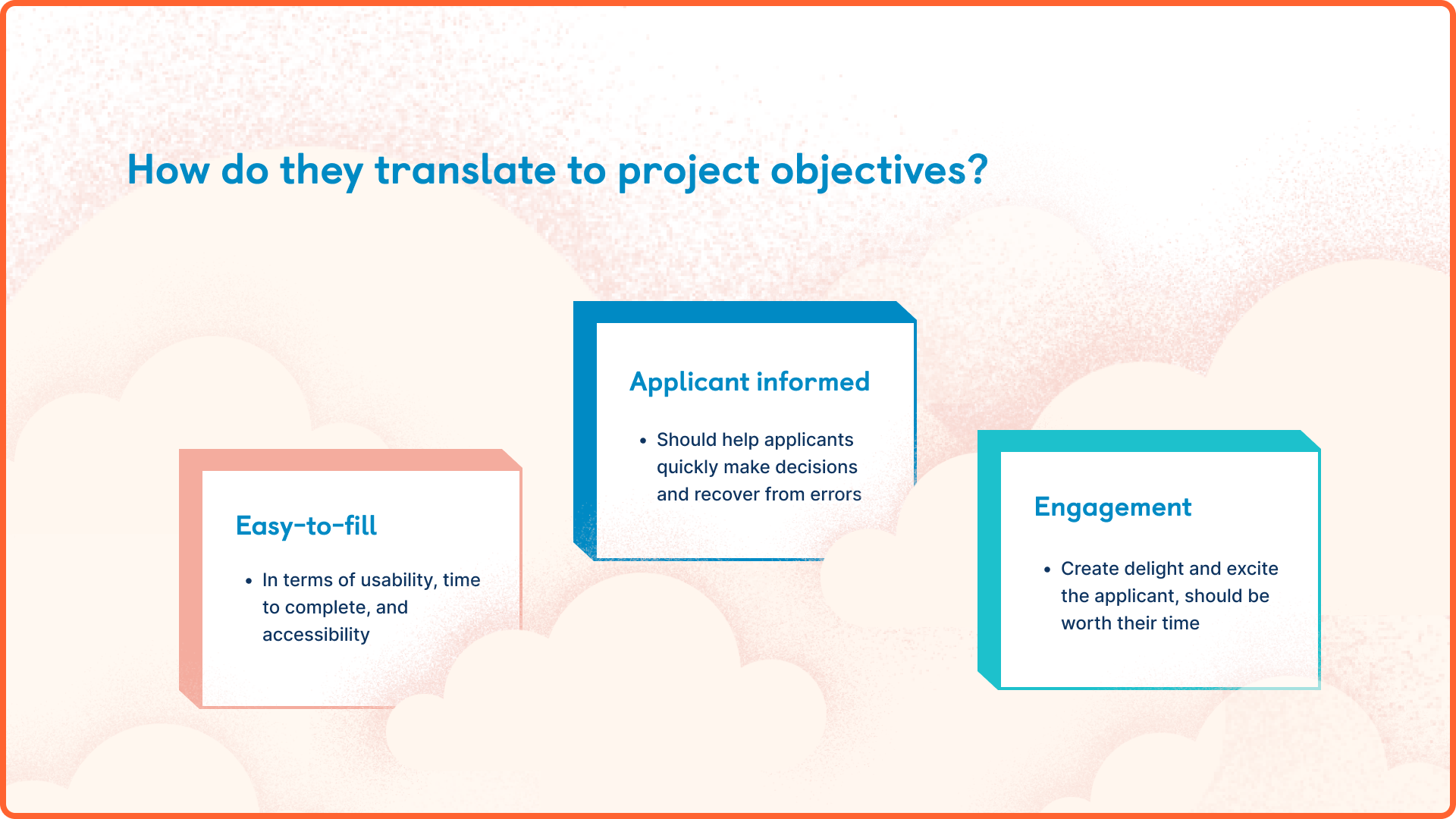
These traits are valuable as they help us define objectives for how we can design for success. From understanding the applicant perspective, we know that the application needs to be:
Easy-to-fill. It should take an appropriate amount of time and easily accessible by all applicants.
Applicant informed. The design of the application should help applicants make decisions quickly and recover from errors easily.
Engaging. Some may attach application processes with negative emotions. Many leave their applications to the last minute as it's something they dread. Creating something that brought delight to the user was a big priority.

To clarify,
this was by no means a personal passion project. As a designer, it may oftentimes feel burdensome when it defining creative direction for a concept. But part of being a great designer is being able to bring out the creativity of the group in a project.
Despite being the main product designer, much of my creative process came from conversations with the wider organizing team. Hacker apps is a culmination of everyone's fragmented ideas, thoughts, and curation.
From brainstorming in docs, to visualizing ideas in Figma, to iterating through final touches, the whole team was on deck.
Application flow
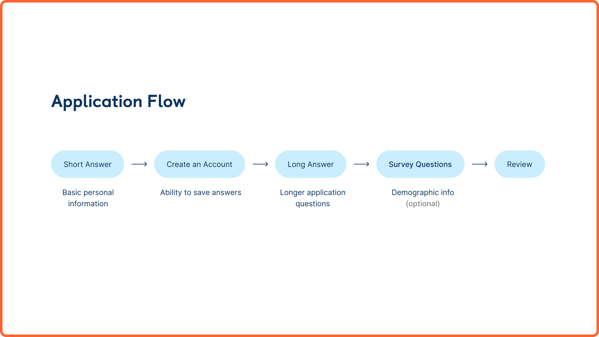
There were five main sections to the application. Each part of the flow was necessary for a specific reason. I'll dive deeper into the why as well as how we were able to tie back to our project objectives below.
1. Short answer
The student begins by answering some short answer questions including their full name, level of study & graduating year, school, program, and location. As fields were filled, the 3D application on the left updated to fit their unique profile. While we didn't need all of this information, this part of the application allowed us to make the experience fun, unique, and personable.
2. Create an Account
Next, the applicant has to create an account with Hack the North. This allows them to save their information moving forwards as well as provide team consent on being able to store their personal data.
3. Long answer
The bulk of the application lies in the long answer section. Since we knew students would likely spend the majority of their time in this phase, we paid attention to how we wanted to craft it in a way that is informed and easy-to-fill.
While the branding of the application persists, the input area is the focus of this screen, as not to distract the applicant. Many visual cues including different input states, progress tabs, and a preview of the next question help to create a more seamless experience.
Form design
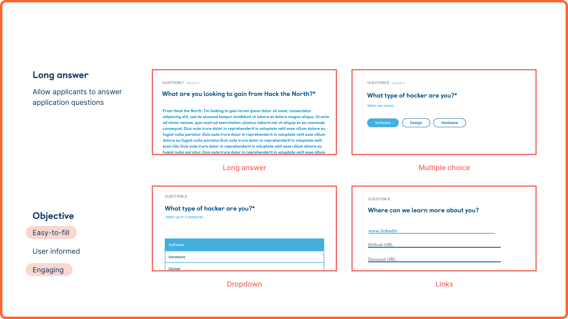
Since this project was designed before the curation of application questions, a unique challenge was designing a collection of input types that would be flexible to work with any type of question.
Some of the options we created included long answer fields, multiple choice selectors, dropdown lists, and a ones that could verify links.
4. Review
When the questions were answered, the applicant was entered a review stage. In this condensed view, our goal was to make it easy to scan and edit information. Each section was separated by a divider and had its own visible edit button.
5. Confirm
And that's it! After applicants have submitted their application, they can view their masterpiece from a birds eye view or download it for later.
Fun fact: some even posted their application to show online, using #HacktheNorth.
Reception
After many late hours in the file, slack threads, and last minute syncs, Hacker Apps was ready to be released to students everywhere. The feedback we got made all the hours of scrutiny worth it.
Oftentimes we get so sucked into the details of our work that we forget the impact it can have on the people we're designing for. This project brought to light how important it is to design for not only functionality, but feeling. It's moments like these that remind me why I continue to do what I'm doing.
Shoutouts
Before wrapping up, I wanted to give another shoutout to the rest of the 2020++ team. Through this project, I was able to work with incredibly ambitious, creative, and talented organizers who really brought this idea to life. It's rare to be able to ideate without constraints and to be encouraged to design bravely. Kudos to y'all!


.gif)
.gif)
.gif)


.gif)

.gif)


.gif)
.gif)