Refreshing the legacy
Dayforce profile experience
Ceridian Product Design Internship ✴ Winter 2021
Context
Ceridian is a global Human Capital Management software platform that combines HR, payroll, benefits, workforce management, and talent management in a single application. Dayforce is their flagship mobile app.
As a product design intern on the Dayforce team, I led the redesign of the profile experience. Over the course of 3 months, I worked alongside a product owner, a senior iOS developer, and received guidance from a senior designer.
Result
45% of testing users said they would engage more with their profile with the redesign.
55% of testing users said they would check others' profiles more often with the redesign.
100% of testing users felt more comfortable completing tasks in the profile with the redesign.
Scroll to see the process ↓
Hey Carol, how might we modernize and enhance the UX of the Dayforce profile page?
Current state
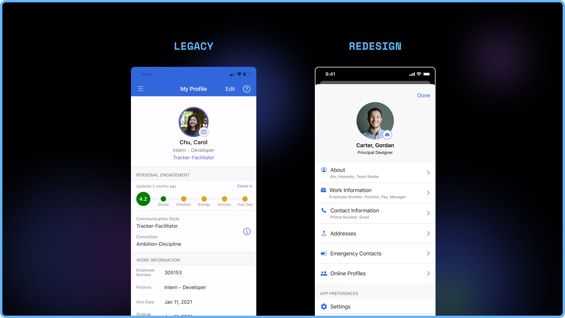
This is what My Profile currently looks like in Dayforce. It allows employees to find and edit work and personal information, as well as access some settings.
Here, the key stakeholders are employees of a company.
Research
I conducted 14 user interviews full-time employees and interns across Dayforce to hear their thoughts on the profile page. This is what they said:
1. "It’s currently harder than expected to find and edit information."
2. "It’s hard to connect with coworkers, especially in a remote climate,"
3. "... and the Profile is visually lacking and outdated."
Goals
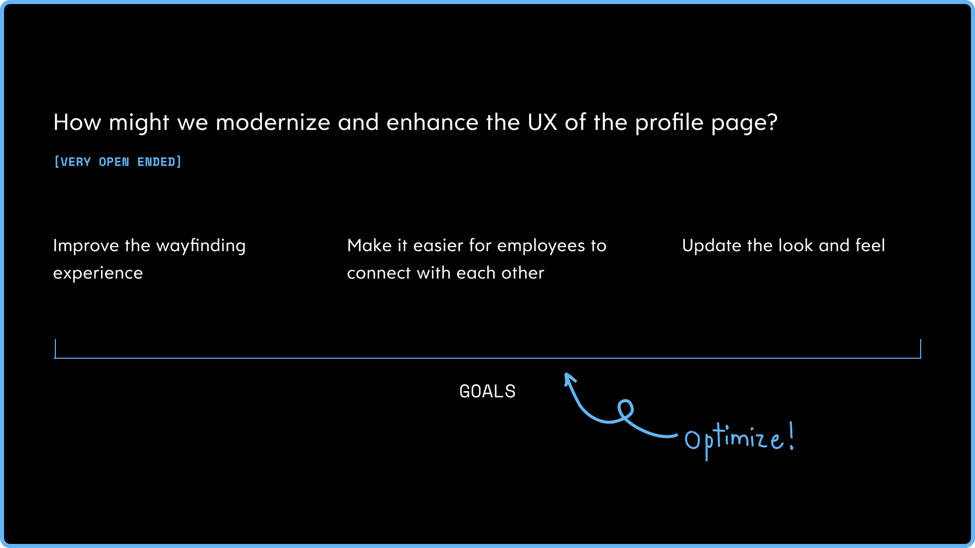
We started off with a pretty open-ended problem statement. We can't work with something so broad. Synthesizing feedback and research told us what modernizing and enhancing the profile page actually meant.
By improving the wayfinding experience, making it easier for employees to connect with each other, and updating the look and feel, we will have enhanced the profile experience.

Ideation for My Profile
For the first goal of improving wayfinding, we came up with these four options for how we can display contents on My Profile. Option 1 laid out all information on one screen, which was most similar to the current experience. Option 2 segmented out the sections of My Profile to introduce an intermediary screen. Option 3 further segmented out subsections within the profile experience, showcasing more categories of information. Lastly, Option 4 displayed these categories using tabs.
After some deliberation, we decided to eliminate Option 4, as we found that it was harder to skim through the categories in a tab format compared to a list. As well, since each tab took up a lot of real estate, this was the least scalable option.

Ideation for others' profiles
The second goal was to make it easier for employees to connect with each other. For this, we ideated more on the types of information we could present rather than the navigation and layout.
From user and competitive research, components that people said they would like to know about their coworkers included work history, online profiles, and simply more information in the about section.

My Profile options
From the ideation stage, we prototyped our remaining top contenders. Again, there were distinct pros and cons for each option. These were some of the tradeoffs:
While Option 1 was the most familiar experience, it may require a lot of scrolling to find certain information.
Option 2 can improve navigation for those who come into the experience with a specific task in mind (navigate via categories), but that's only if the user knows which category their information lives in.
Similarly, Option 3 also makes it easier to access information if the user has a specific task in mind, but only if the user is familiar with the categories at hand.

Others' profile options
In terms of making it easier for employees to connect with each other, we also made two prototypes for what we might be able to see on someone else' profile.
Option 1 was similar to the current design, displaying some personal and work information.
On the other hand. Option 2 included more personal content from the ideation stage, including work history, online profiles, and an extended about section.

Testing
While we had some heuristics to help guide our decision making, we knew we needed to do testing with actual users to prove our hypotheses.
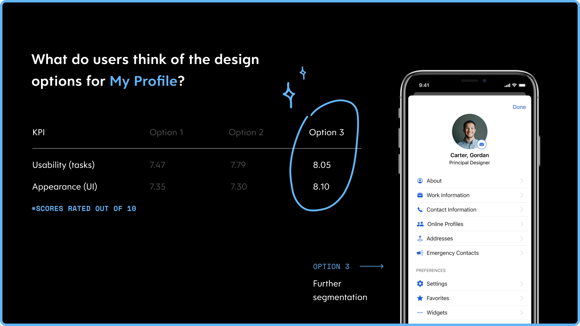
To see whether My Profile options improved wayfinding, we asked participants to perform a series of tasks and asked them to give each option a usability score for each option.
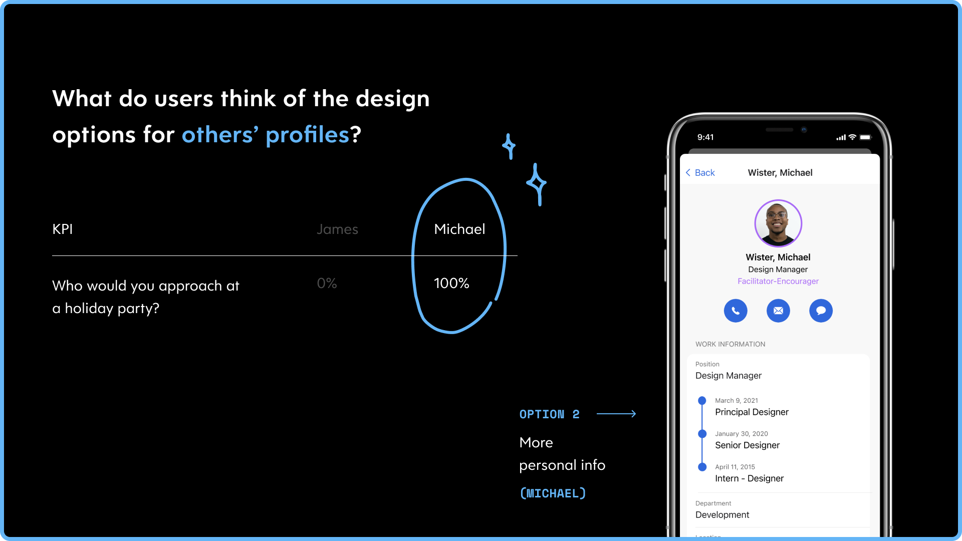
For identifying if one of our options for viewing someone else' profile made it easier for employees to connect with each other, we conducted the holiday party test. We presented both options to users and asked them which employee they'd be more likely to approach at a holiday party and why.
Lastly, to measure the look and feel of each option, participants also provided an overall appearance score.

Test results for My Profile
Looking at both the usability and appearance scores, it's clear that option 3, where information was further segmented into specific categories, was the winner.
Testing users thought that option 3 was clean & organized, and the icons helped with both wayfinding as well as adding personality to the screen. Since most users did come in with a specific task in mind, they were able to quickly find and access the information they needed.
Test results for others' profiles
When presented with the options for others' profiles, 100% of participants said they would rather approach Michael's profile (Option 2) which housed more personal information. When asked why, they said:
"Option 2 feels like it has more a personal touch whereas Option 1 feels like an address book."
"Michael seems more friendly right off the bat."
"Michael seems like he wants to connect."
Learnings
On the technical side, I got to learn and explore iOS native and mobile interaction patterns. For instance, the purpose of choosing a card stack component for the profile page was to communicate it as a second tier flow.
Holistically, I also learned the importance of designing less for more. While there wasn't a huge difference between the legacy and new designs, testing proved that the experience had improved by a lot. This tells us that we often don't have to do a super grand redesign, but we should spend more time figuring out the right problems to solve.


